Seperators very large
Not sure if this is a design choice or something that can be improved, but the gaps in panels and other various gdm screens seems very large as seen in the following pictures:
Edit: Separators now have lines within them, similar to the default theme, so they look better. Padding still seems large in some panels.
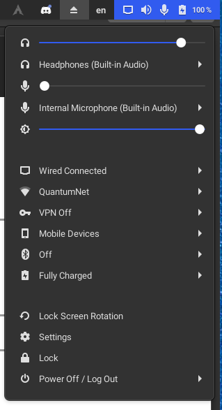

For the power off menu, the separator between the buttons and the rest of the text is very large.